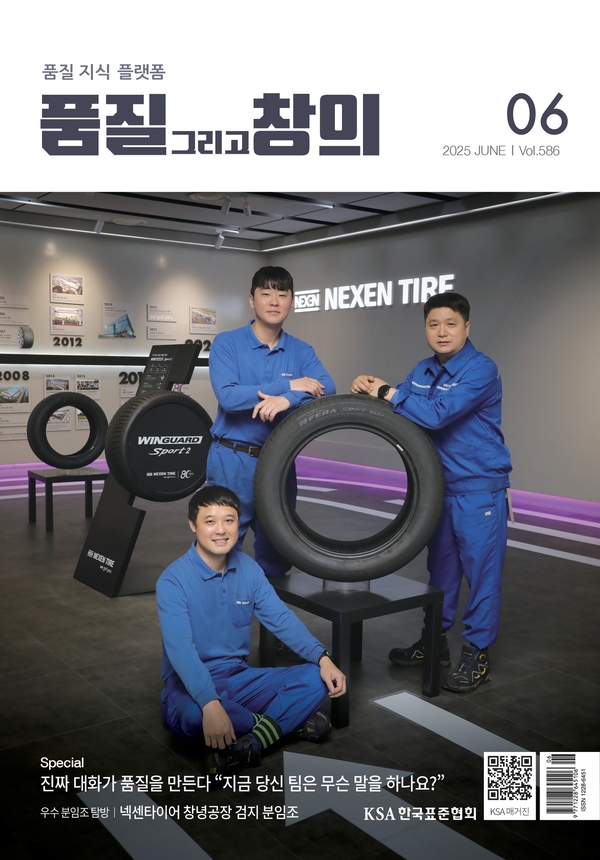
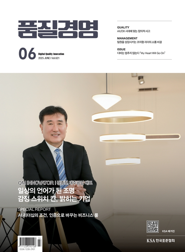
월간지 E-book 품질 그리고 창의 2025년 8월호 eBook 보기 품질경영 2025년 8월호 eBook 보기 <div class="objTag"><br> <h2>월간지 E-book</h2> <div class="container"> <div class="card"><img src="https://ksa.or.kr/ebook/ksa_qcc/assets/thumbnail.jpg" alt="품질 그리고 창의 6월호" class="cover" align="" border="" hspace="" vspace=""> <div class="title">품질 그리고 창의</div> <div class="title" id="currentMonth">2025년 7월호 </div> <a href="https://ksa.or.kr/ebook/ksa_qcc/index.html" class="button" target="_blank" style="color:#ffffff;">eBook 보기</a> </div> <div class="card"> <img src="https://ksa.or.kr/ebook/ksa_qm/assets/thumbnail.jpg" alt="품질경영 6월호" class="cover" align="" border="" hspace="" vspace=""> <div class="title">품질경영 </div> <div class="title" id="currentMonth2">2025년 7월호 </div> <a href="https://ksa.or.kr/ebook/ksa_qm/index.html" class="button" target="_blank" style="color:#ffffff;">eBook 보기</a> </div> </div> <script> const now = new Date(); const year = now.getFullYear(); const month = now.getMonth() + 1; let lbl = year + '년 ' + month + '월호'; $('#currentMonth').text(lbl); $('#currentMonth2').text(lbl); </script> <style> body { font-family: 'Noto Sans KR', sans-serif; background-color: #F4F6F9; margin: 0; padding: 40px 20px; } h2 { text-align: center; color: #002F6C; margin-bottom: 40px; font-size: 26px; } .container { display: flex; justify-content: center; flex-wrap: wrap; gap: 32px; } .card { background: #ffffff; border: 1px solid #d3dbe4; border-radius: 12px; box-shadow: 0 4px 12px rgba(0,0,0,0.05); width: 360px; text-align: center; padding: 20px; transition: transform 0.2s ease; display: flex; flex-direction: column; } .card:hover { transform: translateY(-5px); box-shadow: 0 6px 16px rgba(0,0,0,0.08); } .cover { width: 100%; height: auto; border-radius: 8px; margin-bottom: 15px; border: 1px solid #ccc; } .title { font-size: 18px; font-weight: 600; margin-bottom: 10px; color: #002F6C; } .button { display: inline-block; padding: 10px 20px; background-color: #002F6C; color: #ffffff; border-radius: 6px; text-decoration: none; font-weight: bold; font-size: 14px; margin-top: auto; } .button:hover { background-color: #001E44; } /* 반응형 스타일 */ @media (max-width: 768px) { h2 { font-size: 22px; } .container { flex-direction: column; align-items: center; } .card { width: 90%; max-width: 360px; } } </style> </div>